Houston as art using Google Earth
I was reading about artists who work photos that already exist rather than make more of them - a book called 'Post-Photography' by Robert Shore. Among the featured artists, there were a few who search through google maps looking for obscure places, glitches in rendering, or making photo-merges with immense detail. One of these artists, Clement Valla, describes the vast database of Google's images as the product of algorithms, created by many sources of cameras and sensors. Because of this, he argues that he is often 'seeing an image materialize...that no other human has ever seen'. An interesting thought.
I've used google maps in the past to hunt for locations, but thought it would be interesting, in the vein of the Post-Photography artists, to explore screen grabbed maps as compositions in themselves.
Finding Houston's compositions
Obvious places to start looking are highways and rail lines. These provide lines and s-curves that are pleasing to the eye. Complicated highway intersections are a personal favorite. Looks like Spaghetti. Regular streets can be interesting but Houston, like many American cites, is afflicted by the grid system. The challenge here is to find neighborhoods with windy streets, often forced by proximity to a stream or bayou. Perfect grids may lack natural flow, but can be a great study in repeat patterns, symmetry and pattern disruption.
Geometric shapes can be found in many places. The tree clusters at Waugh and Memorial are a good example. The landscaping efforts are best viewed from above.
Of course, Google Maps' imagery is in colour, but colours are often dominated by greens and browns that may not be all that interesting. Black and white is an easy way to get rid of the distracting colours and focus the eye on the more interesting components - shape and texture. The Astrodome's roof is a mosaic of rectangular skylights in pie-piece arrangements. Photos of the roof from inside the dome look great, but this bird's eye view perfectly shows the layers of architectural patterns without the distraction of colour.
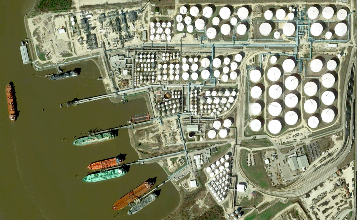
Online maps ore often the only way to view certain, otherwise restricted parts of the city. The examples below are of a NASA airplane on Ellington's taxiway and the industrial texture of a refinery near the port of Houston.
We've just covered taking direct screen-grabs from the available maps, but post-processing opens up another world of possibilities: colour-manipulation, image repetition and symmetry, image-stitching. I'll cover these aspects in a future post.
From streets to continents
If you do go exploring the Earth, spend some time zoomed out looking at geological features that are millions years in the making. Beyond Galveston is the Gulf of Mexico, laden with sediments under the water sliding over a Jurassic salt deposit. This gives the sea floor a dimpled texture all they way out to the limit of the salt. The image on the right is shown rotated so north is to the left. You can easily spot the urban spider-web of Houston in the lower-left corner.
From pixels to real places
The is some stand-alone value to finding compositions in Google Maps, but scouring through imagery of Houston brings me back to my original use for the maps - location hunting. How do things that look great from above look from the side? From below? There are parts of the city I would never think to visit, but now there is a reason to explore.


